Last month, we covered a blogger roundtable with DC Water, discussing about a wide range of issues related to the DC utility that supplies our drinking water and treats the sewage of DC and surrounding municipalities.
Our website reported on an interesting map that showed the location of reservoirs in the city, and how each one serves areas at a common elevation, regardless of the reservoir's proximity. Unfortunately, the map had to be redacted due to "security concerns" regarding the ability to glean information regarding the water system from the map.
Interestingly enough, the Washington Post ran an article ten days ago regarding a broken water main in Montgomery County. That article included a link (PDF) to a map that shows the water main network for the Washington Suburban Sanitary Commission (WSSC) in Prince Georges and Montgomery counties.
To the best of our knowledge, no one has requested that map be redacted, since it has been online longer and hosted on a website that gets viewed my many more people than the DC map we posted. Perhaps it's because the map is not very sharp, thus making it difficult to ascertain the location of information depicted on the map.
12 July 2010
09 July 2010
They paved paradise, and put up a parking lot?
While parking lots are on the wane in some parts of town, that's not the case everywhere. Houses in Truxton Circle have been torn down at a notable rate recently, and some of those have simply been turned into expanses of asphalt to house cars instead of people.
Parking lots draw the ire of many who live in DC. They're not the best use for limited city land and they're often ugly in appearance. Close to downtown in recent years, though, they have been replaced by buildings that increase the city's tax base by providing more space for residents and businesses. Often, these new buildings increase the amount of parking in the city, as there are more spaces in two or three levels of underground parking than there are at one level on the surface.
A couple weeks ago, at the Other 35 Percent, Cary Silverman mentioned a proposed change in Baltimore's zoning code that would require that vacant lots be used for parkland or green space instead of parking lots after buildings are torn down.
This isn't the rule in DC. Temporary parking lots proliferate in places where buildings have been recently torn down. All over Near Southeast and Southwest near the Nationals ballpark, parking lots were built on land that is intended to be developed, once the economy turns a corner and demand for new construction increases. Another recent example of a new parking lot can be found just east of North Capitol Street on the unit block of P Street.
(This isn't the beautiful Hawaiian landscape that inspired the line from Joni Mitchell's "Big Yellow Taxi" in the title, but please indulge me.)
At my old blog, bloomingdale (for now), I noted a garish pop-up that was being constructed on the unit block of P Street NE. Next door to that abomination were the burned-out shells of rowhouses that had existed on the site for a century. Those shells used to house people, but they had become vacant and neglected. There are and have been many more houses similar to those that have been successfully been turned back into nice houses lived in by people who pay taxes and contribute to city life.
Eventually, the news came that these houses were to be torn down instead of being renovated for some contributing use. I documented the demolition of those houses, asking the construction crew what use was intended for the property. At the time, I was told it would become an apartment building.
In the meantime, the local real estate market tanked, especially in sub-markets that would be considered "marginal." Truxton Circle, (especially along North Capitol Street) could certainly be considered one of those marginal markets. Whether an apartment building was ever really intended for those lots we'll likely never know. (I checked DCRA's PIVS website for construction permits at these properties, and found nothing.)
So, what became of that empty land? A parking lot:
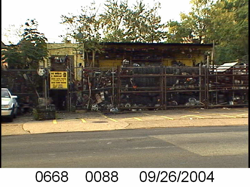
Granted, it wasn't all buildings beforehand. There was a used tire store there as well (see what it looked like in 2004 here), so one could argue an empty lot isn't the ugliest thing possible on this space. Today, though, what good is a parking lot on that land? There is plenty of parking nearby for those who might be driving to the their jobs across the street at DDOT's offices:
Other new office space built nearby has plenty of underground parking, and is within a very short walk of the New York Avenue Metro station.
Would a nice temporary green space have worked here? It's hard to say, but that part of the city and Ward 5 certainly has very little green space, and could use every little bit it can get. Look at this map (it's a PDF) from the Capital Space plan, and note that there is a area devoid of large parks centered on the Eckington and Truxton Circle neighborhoods.
I don't see how an empty parking lot (since it doesn't appear to be attracting a lot of business) could possibly pay the bills.
Cross-posted at Greater Greater Washington.
Parking lots draw the ire of many who live in DC. They're not the best use for limited city land and they're often ugly in appearance. Close to downtown in recent years, though, they have been replaced by buildings that increase the city's tax base by providing more space for residents and businesses. Often, these new buildings increase the amount of parking in the city, as there are more spaces in two or three levels of underground parking than there are at one level on the surface.
A couple weeks ago, at the Other 35 Percent, Cary Silverman mentioned a proposed change in Baltimore's zoning code that would require that vacant lots be used for parkland or green space instead of parking lots after buildings are torn down.
This isn't the rule in DC. Temporary parking lots proliferate in places where buildings have been recently torn down. All over Near Southeast and Southwest near the Nationals ballpark, parking lots were built on land that is intended to be developed, once the economy turns a corner and demand for new construction increases. Another recent example of a new parking lot can be found just east of North Capitol Street on the unit block of P Street.
(This isn't the beautiful Hawaiian landscape that inspired the line from Joni Mitchell's "Big Yellow Taxi" in the title, but please indulge me.)
At my old blog, bloomingdale (for now), I noted a garish pop-up that was being constructed on the unit block of P Street NE. Next door to that abomination were the burned-out shells of rowhouses that had existed on the site for a century. Those shells used to house people, but they had become vacant and neglected. There are and have been many more houses similar to those that have been successfully been turned back into nice houses lived in by people who pay taxes and contribute to city life.
Eventually, the news came that these houses were to be torn down instead of being renovated for some contributing use. I documented the demolition of those houses, asking the construction crew what use was intended for the property. At the time, I was told it would become an apartment building.
In the meantime, the local real estate market tanked, especially in sub-markets that would be considered "marginal." Truxton Circle, (especially along North Capitol Street) could certainly be considered one of those marginal markets. Whether an apartment building was ever really intended for those lots we'll likely never know. (I checked DCRA's PIVS website for construction permits at these properties, and found nothing.)
So, what became of that empty land? A parking lot:
Granted, it wasn't all buildings beforehand. There was a used tire store there as well (see what it looked like in 2004 here), so one could argue an empty lot isn't the ugliest thing possible on this space. Today, though, what good is a parking lot on that land? There is plenty of parking nearby for those who might be driving to the their jobs across the street at DDOT's offices:
Other new office space built nearby has plenty of underground parking, and is within a very short walk of the New York Avenue Metro station.
Would a nice temporary green space have worked here? It's hard to say, but that part of the city and Ward 5 certainly has very little green space, and could use every little bit it can get. Look at this map (it's a PDF) from the Capital Space plan, and note that there is a area devoid of large parks centered on the Eckington and Truxton Circle neighborhoods.
I don't see how an empty parking lot (since it doesn't appear to be attracting a lot of business) could possibly pay the bills.
Cross-posted at Greater Greater Washington.
Tags:
historic preservation,
parking,
parks,
Truxton Circle
07 July 2010
Vince Gray on IZ, New Communities, and rent control—oh my!
Both jaime and IMGoph contributed to this post.
We sat down with Vince Gray at Ben's Chili Bowl on Monday, along with DCist, We Love DC, and Borderstan for the first "Blogger Roundtable" discussion of his mayoral campaign. Gray's stated goal is to unite residents in "One City," and he noted that while DC is currently "very divided by geography, age, gender, and race," ultimately "people have got to feel like there's a place for them." While education, economic development, and workforce education are pieces of this puzzle, without suitable and ample housing for all, we will continue to struggle as a divided city.
Gray noted that he pushed for inclusionary zoning from the start of the two-and-a-half year struggle to get the regulation on the books, working through one emergency legislation after another while the Fenty administration delayed implementation. Lamenting the loss of potentially hundreds of affordable housing units during the hold-up, Gray says that if elected mayor, he will "aggressively implement" IZ.
Another housing issue we discussed was rent control. Under current legislation, which Gray co-sponsored, rent control is up for re-authorization every five years. Gray promised that, as mayor, he would work to make rent control permanent, (ed. note—Lydia DePillis reported on this today at the City Paper's Housing Complex blog) though he acknowledged it could potentially be challenged as unconstitutional.
Avoiding displacement is perhaps one of the most daunting challenges to housing equity. Under federal programs like HOPE VI, new mixed-income, and sometimes multi-use, developments are built with the intention of providing homes for both current and new residents of the community. A hiccup comes when low-income residents "temporarily" move to make room for new construction. Under the New Communities Initiative—established at the end of Anthony Williams' administration—Barry Farm (Ward 8), Lincoln Heights/Richardson Dwellings (Ward 7), Northwest One (Ward 6) and Park Morton (Ward 1) are to "transform [from] highly concentrated low-income neighborhoods into healthy mixed-income neighborhoods." Perhaps the most important component of this initiative is the guiding principle of "build first" which "calls for new housing on publicly-controlled lands to be built prior to the demolition of existing distressed housing to minimize displacement."
When asked how best to retain current residents while improving housing, education, and economic opportunities, Gray pointed immediately to New Communities. While not a new initiative, it is one we seem to have lost track of as the economic boom turned into a bust. The reality is that while most of us are facing challenges in the current climate, many residents in our city who were struggling at the peak are in further distress now. Gray, at least on the campaign trail, is able to recognize this gulf that continues to divide DC, and he seems to be genuinely interested to continue to push for solutions that have been staring us in the face for years now. Issues like inclusionary zoning, rent control, and New Communities are all ways the city can help bridge that gulf—they just need to truly be championed in order to work. It will take serious sustained effort from all the city's leadership to accomplish these goals.
Cross-posted at Greater Greater Washington.
Tags:
housing,
inclusionary zoning,
rent control,
Vince Gray
24 June 2010
That nice map—nevermind
Well, in the "security" obsessed reality we live in, having something as simple as a not-very-high-resolution map of water pipes out there on the Internet is enough to make government-types wet their pants (water related puns—gotta love 'em!).
This morning, I received notice from Alan Heymann, the Public Affairs Director of DC Water, that the EPA contacted DC Water to let them know they believe the map is "sensitive information" and should not have been shared. Now, I'm not naive, and I understand the need for vigilance regarding threats to infrastructure in the nation's capital, but it seems to me that this kind of information doesn't add much value for someone looking to do harm to our water supply. The easiest places to do so, the open-air reservoirs at Dalecarlia, Georgetown, and McMillan are all well-guarded. Just try to take a photo at any of them, and a gruff person will threaten you with physical harm if you look in their direction for too long.
One of my mantras is "information wants to be free," so my initial response was to say, "Hell no, this is public property, and the public has a right to know about this." According to Flickr statistics, nearly 1200 people have taken the time to click on the largest version of the map, so the bird has flown the coop, so to speak, and the data is out there in the wild now.
But, Mr. Heymann has been a great help in solving the problem of 'Montello Springs' as well as offering the tour of the Bryant Street Pumping Station, so we've decided on a compromise. The highest resolution version of the map has been removed from Flickr, and we're including an annotated version below that shows the location of the reservoirs. You can still get the basic gist of our previous article from this map—that different sections and elevations of the city are fed from reservoirs that aren't necessarily the closest to that part of the city. That information is still readily available in text form on DC Water's website.
In thinking about all of this, Jaime discovered the EPA website called "MyEnvironment," where they tout "transparency, transparency, transparency" and openness, and discuss the sharing of maps and data with the public (http://dirt.asla.org/2009/09/08/government-2-0-epas-myenvironment/). In light of the recommendation to remove this map, we asked Alan Heymann if he feels that sites like "MyEnvironment" can ever truly meet the goal of openness? Should government agencies set explicit limits on what is appropriate to share? Here's his response:
I agree that generally, more information is better than less information. Many District residents don’t know much about the facilities and the agency that supply their drinking water, which was the idea behind the bloggers’ roundtable that you attended last week. Likewise, not everyone gets a chance to visit the inside of a pumping station, but you have the ability to take your audience there through your photos and words.
The General Manager and the rest of the team were pleased to see your informative, thoughtful take on the distribution system on Tuesday. At the same time, especially because this is the nation’s capital, we need to be mindful of security concerns. When the U.S. EPA mentioned to us that the posting of a detailed map online might put sensitive information into the wrong hands, I made the request that the map be removed from your post.
As you mentioned in the earlier post, our new name and logo are just part of an effort to connect with our customers in ways this agency has never done before. However, in hindsight, I probably erred a little too far on the side of openness and transparency in providing a high-resolution map of the distribution system for the web. I appreciate greatly your cooperation in agreeing to take it down, and I want to thank the GGW readers for their understanding as well. I’m looking forward to collaborating with you on future posts.
Tags:
cartography,
censorship,
DC Water,
EPA,
national security,
neighborhoods
22 June 2010
Where does your DC Water come from?
On Thursday, June 17th, I was invited (along with other local bloggers) to a roundtable with the General Manager of DC Water, George S. Hawkins.
Mr. Hawkins spoke about the culture of accountability that is being nurtured at DC Water (formerly known as the DC Water and Sewer Authority / DC WASA), discussed the ongoing lead-in-the-water saga, and spoke at length about his interest and excitement regarding all things environmental (he was formerly the head of the District Department of the Environment). Other bloggers have covered many of these points well, so there's no need for me to rehash them here (though I do know that a Greater Greater Washington post which will touch on a few other points is currently being worked on, and I will add a link to it when it's ready).
I'd like to take the time to share with you one of the fascinating things that we learned during our tour of the Bryant Street Pumping Station. If you read the information at that link, you can learn about the seven service areas that provide water to the residents and businesses of the city.
Briefly, all the water we use comes from the Potomac River near Great Falls, is treated at the Dalecarlia Reservoir by the Washington Aqueduct (a division of the U.S. Army Corps of Engineers), and is then sold to DC Water. That water is then pumped to reservoirs all over the city. The reservoirs are located at different elevations, and they supply water to points below them. From those reservoirs, the water flows downhill (via gravity) to houses and businesses.
Check out this great map:
(Click on the map to view larger.)
The legend at the bottom of the map shows the color-coding which indicates the approximate elevation of different parts of the city. As you can see, blue water mains run along roads at the lowest elevations (between zero and 70 feet above sea level). Red water mains are located at the second elevation range (between 70 and 140 feet), green at the third range, orange at the fourth, and brown at the highest elevations. The red and green areas east of the Anacostia River are separate zones than those west of the river, while the lowest zone (blue) spans both sides of the river.
What fascinated me the most was the fact that this means that the reservoir that serves your house isn't necessarily the one closest to your house, or even in your quadrant of the city! For example, our house is in Trinidad. While the closest reservoir is at Brentwood Parkway and New York Avenue (just north of Gallaudet University), we are served by reservoirs in Berkley and at the Armed Forces Retirement Home, both across town in the Northwest quadrant of the city. The reservoir nearest our house serves locations at the lowest elevations (below 70 feet), from lower Georgetown and Southwest in the west all the way to Rosedale and Deanwood in the east.
Some other examples of reservoirs and the neighborhods they serve:
- The reservoir at Van Ness and 44th NW serves neighborhoods at intermediate elevations across the city like Brookland, Woodridge, and Michigan Park in Northeast; Columbia Heights, Mt. Pleasant, Adams Morgan, and Kalorama in the center of the city; and Foxhall and the Palisades in Northwest.
- Two of the reservoirs at Fort Reno serve higher elevations like Glover Park, Cleveland Park, American University Park, and Forest Hills west of Rock Creek Park; and Petworth, North Portal Estates, Manor Park, and Takoma east of Rock Creek Park.
- The highest reservoir at Fort Reno serves the highest elevations in the city—neighborhoods like Tenleytown, Chevy Chase, and Shepherd Park.
Cross-posted at Greater Greater Washington.
Tags:
cartography,
DC Water,
neighborhoods
21 June 2010
One more example of a horrible map
OK, we're going to have some real, honest-to-goodness posts very soon, but to tide you over try this on for size:
Since the last District Curmudgeon post was about maps, I thought it would be a good idea to point out another one that's been bugging me for months now. The above series of maps is used in the Express newspaper to highlight the locations of news stories, often for the "Weekend Review."
Look at that map on the right, though. I realize this is meant to be a generalization, but there's no good reason for the map to be done as poorly as it has been. Here are the biggest problems I see—feel free to add more critique in the comments below:
C'mon, Express, spend 5 minutes and make a more accurate map for your readers. There's no need to publish something this inaccurate and misleading.
Since the last District Curmudgeon post was about maps, I thought it would be a good idea to point out another one that's been bugging me for months now. The above series of maps is used in the Express newspaper to highlight the locations of news stories, often for the "Weekend Review."
Look at that map on the right, though. I realize this is meant to be a generalization, but there's no good reason for the map to be done as poorly as it has been. Here are the biggest problems I see—feel free to add more critique in the comments below:
- The islands of Java and Sumatra have been merged into one large island.
- Only the North Island of New Zealand is shown. The larger South Island has been unceremoniously deleted. (Not to mention that New Zealand is FAR too close to Australia.)
- The western end of New Guinea has disappeared, while the island of New Britain has become an appendage on New Guinea's east.
- The Philippines, Borneo, and the Sumatra/Java monster have all migrated south and are not close to being in the right relation to Guinea and Australia.
C'mon, Express, spend 5 minutes and make a more accurate map for your readers. There's no need to publish something this inaccurate and misleading.
Tags:
cartography,
Express,
miscellany
07 June 2010
There are better cartographers out there
This map can currently be found at bus stops all over Washington, DC. It's an advertisement for the National Responsible Fatherhood Clearinghouse, a government organization that "supports efforts to assist States and communities to promote and support Responsible Fatherhood." The sentiment is more than admirable, it's crucial: if you're a dad, spend time with your children. The poster/ad shows places where one can go out and have fun at any number of neat, free parks all over the city.
Of course, as a cartographer and a curmudgeon, I have a few gripes. The design leaves more than a little to be desired. Why are there drop shadows on the orange circles used as labels for the parks, but no shadow on the part that points to the locations? The linework used for the roads is clunky, and there are some terrible transitions from one level of road hierarchy to another (like where Virginia Avenue NW ends at the Rock Creek and Potomac Parkway). The interior glow on the bodies of water and the parks seems like an unnecessary embellishment. But the biggest problem is the labeling of roads.
First, why are the quadrant labels a mix of upper- and lower-case letters (i.e. Ne instead of NE)? Second, there are many, many errors, such as North Capital Street instead of the correct North Capitol Street, and South Capitol Street is labeled North Capitol Street Ne—a double error. Here's a not necessarily exhaustive list:
- 17th Street NW label next to White House is the wrong color.
- H Street NW is labeled H St Ne.
- Cleveland Avenue NW labeled Ceveland Ave Nw.
- Massachusetts Avenue NW labeled Massachusetts Ave Ne twice.
- Rock Creek Church Road NW labeled Allison Street Nw.
- 7th St NW label too far north (falls on Georgia Avenue NW).
- New York Avenue NW labeled New York Ave Ne.
- 29th Street NW labeled 29th St N.
- 19th Street NW in Foggy Bottom labeled 18th St Nw.
- Maine Ave label obscured by Thomas Jefferson Memorial label.
- 2nd St Ne label technically straddles NE and SE.
- 13th Street NE is labeled 13th St Nw.
- Rhode Island Avenue NW is labeled Rhode Island Ave Ne.
- Why is T Street NW even labeled for the short section of it that's highlighted?
- Michigan Avenue NE is labeled Michigan Ave Nw.
- It falls off the right edge of the map, but the label on 21st Street NE appears to say 21st Sh St Ne.
- Other labels, which fell within the extent of the PDF of the poster (see link below) were cut off in the version hung in the bus shelters.
(A PDF of the map can be found here.)
Tags:
cartography,
DC knowledge
Subscribe to:
Posts (Atom)